Design thinking vs design history:
Why it matters to future-makers
By Teresa Di Cairano |
As innovators, we rarely look back. After all, the rearview mirror is only for reversing. Design thinking methods and processes help us to get away from our analytical traps about the past, that can often lead to incremental, rather than breakthrough innovation. These approaches also offer a common language to work collaboratively. But with all that goodness, are we missing something? Should design history also matter to future-makers?
Our recent focus on design thinking really got its momentum from IDEO and the dSchool at Stanford. A school of thought that brought human-centered approaches to an otherwise more engineering or industrial design focused discipline. It also provided non-designers in business and government a way to tackle innovation challenges with a ‘prototype’ mentality. This enabled more perspectives and flex than the tyranny of traditional business planning or formal strategy development would allow.
Recently, design thinking is also proving very popular with digital designers as we attempt to move the needle from apps to digital brand experiences. However, companies are also embodying their brands through physical spaces.
While online retail is definitely on the rise, we also see the rise of flagship brand stores from Apple to Nike and Virgin Travel. Meanwhile, online companies like Tangerine bank and Etsy are even including bricks and mortar spaces as part of their brand experiences.
Fast forward versus pause:
Back to design history. The design of electronic and digital products rarely looks back as we march forward to faster, better and cheaper devices - almost as though it has no history. Meanwhile the design of physical spaces ebbs forward and back with concepts like architectural revival periods. At other times, we simply pause and take a step back on the prevailing design doctrine to see if we should be polishing off or elaborating an idea that started in the ‘50’s or ‘60’s. Think of our (or my) current obsession with mid-century modern inspired furniture design.
Inspired is an operative word for design. Inspiration from human-centered design approaches certainly favors client inquiry over designer ego, so we have a what-can-we-learn-from-customer-pain-points attitude. Design thinking methods are well documented with various tools for inquiry. But artists and designer-led approaches also reveal human pain points, value shifts and emotional needs. This approach, however, is somewhat black boxed – no flow charts, documented methods or post-its can clearly define the artistic or designer-led approach. Yet it also begins with observation, assimilation and finally synthesis into a piece. So how do we learn from them?
The semiotics of design:
If art history teaches us to study the artifacts and their context, then perhaps design history can work in the same way. In this process of ‘pause and reflect’ we can also explore the theories, concepts and symbolism that help explain (sometimes only retrospectively) the thinking behind an artifact or a movement. It also helps to understand that perhaps, say the revival of plywood, and the eschewing of desks and cubicles in favor of large shared tables in office design for companies from Startups to Facebook, means something to a new generation that’s different from the values of a preceding one. It may also reveal something in common with the vision of the designers of the 40’s or 50’s that first experimented with (the now iconic) bent plywood furniture pieces.
 |
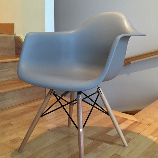
When Charles and Ray Eames designed a fiberglass chair in 1950 with the goal of ‘getting the most of the best to the greatest number of people for the least’, it reflected the emerging values of the time. |
|
 |
These approaches may be closer to the Chicago school of thought (with its roots in the Bauhaus) that acknowledge that while design process matters, so does design history and theory. Or it may have something to do with design/art history and understanding ‘the necessary poetry of things and that societies recorded their concerns and aspirations not only in writing, but in things’ as Neil MacGregor (Director of the British Museum) thoughtfully put it in A History of the World in 100 Objects.
The semiotics of design – understanding what an object means to a person, could be enhanced with a retrospective study of artifacts. Sometimes it is only with perspective of time that we can observe value shifts like transparency, accessibility, and simplicity. When Charles and Ray Eames designed a fiberglass chair in 1950 with the goal of ‘getting the most of the best to the greatest number of people for the least’, it reflected the emerging values of the time. Recently it is experiencing a revival as an iconic chair and is seen in trendy homes, boutique hotels and airports, and perhaps also once again signals a shift in values. The red Valentine Portable Typewriter designed by Ettore Sottsass in 1969 (now part of the MoMA collection) was a precursor of the consumerization of office technology, and that utility need not come in a boring industrial box (think of course of Apple today).
 |
We can learn from the history of the future. |
As we move to a multi-channel, digital-physical world, this may be a good time to include the history of design in our approaches. Good design ideas have always been about being on the edge and as such we can learn from the history of the future. The study of objects and material culture also helps us understand values and emerging value shifts in a different, but complimentary way from design thinking. In doing so, the more meaningful our design for the future can be.
email your comments to: teresa@intervista-institute.com
1. https://web.archive.org/web/20040430015830/http://storiaolivetti.telecomitalia.it/uk/cgi-bin/Societa/design_olivetti.asp
© 2016 Intervista Inc.

![]()
![]()

![]()
![]()